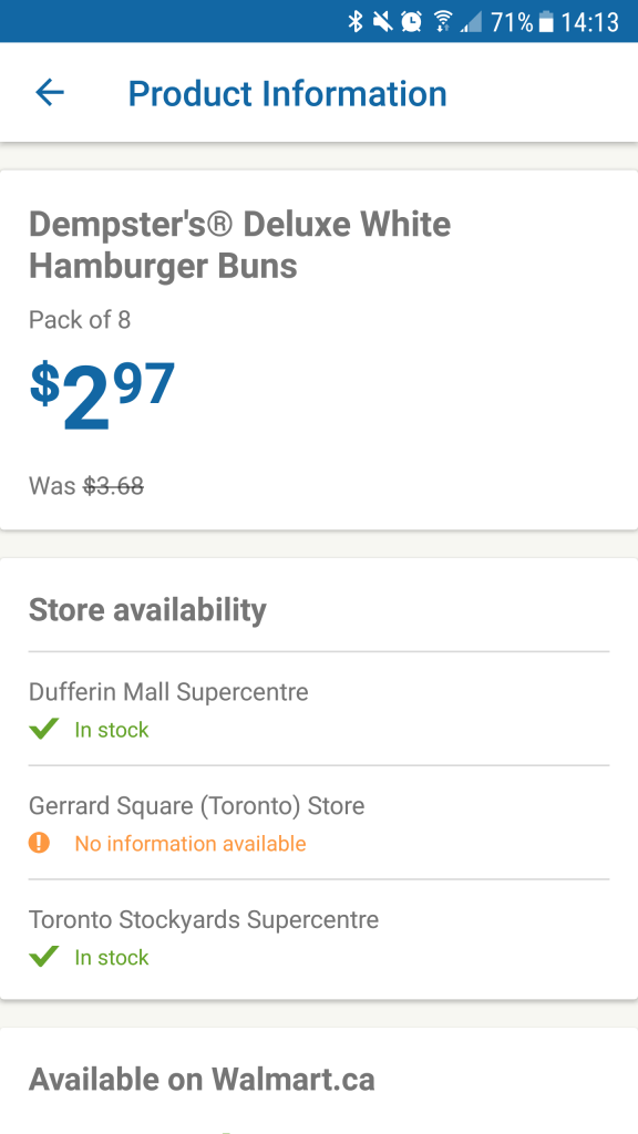
Walmart Canada is one of Canada’s largest retailers, with over 150 stores. The company is also one of Canada’s largest online commerce providers, with a fast-growing mobile shopping customer pool.
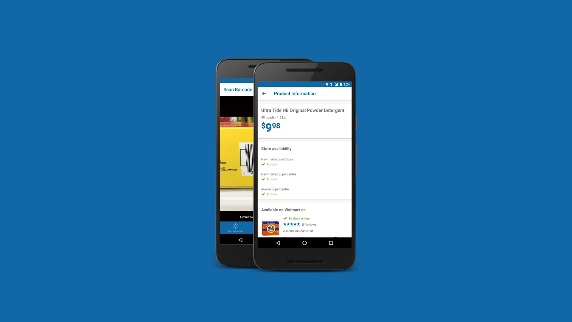
Overview
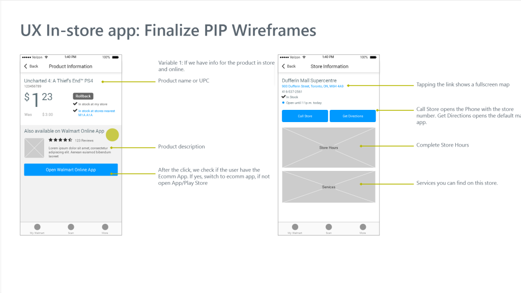
Walmart wanted a companion app that customers could use at home or inside a Walmart to scan items and quickly find their prices and availability in their selected store.
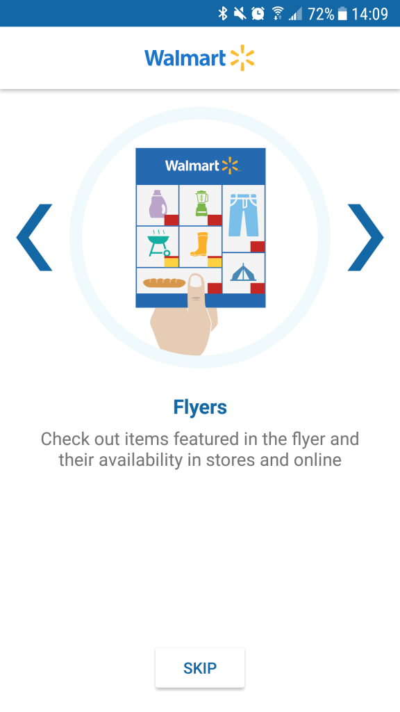
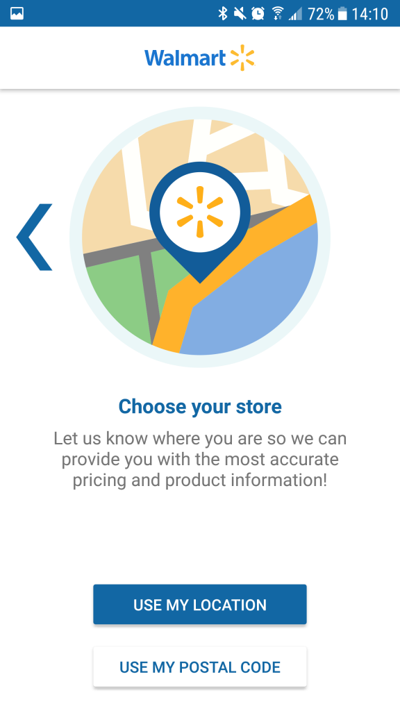
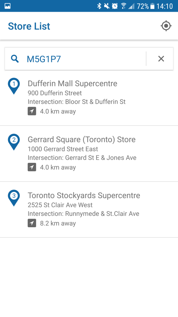
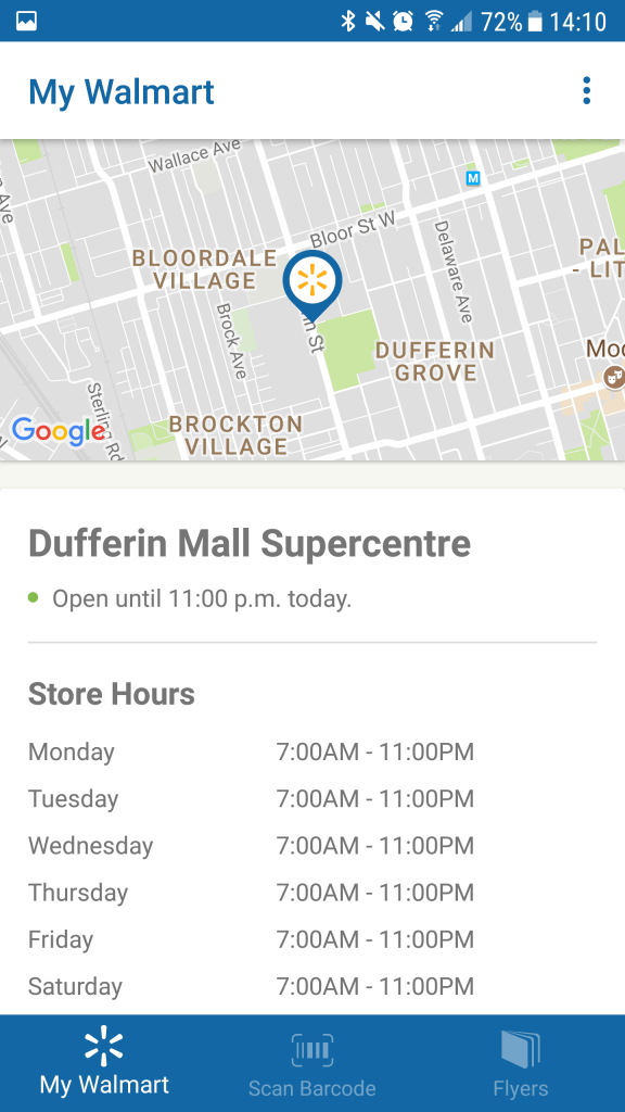
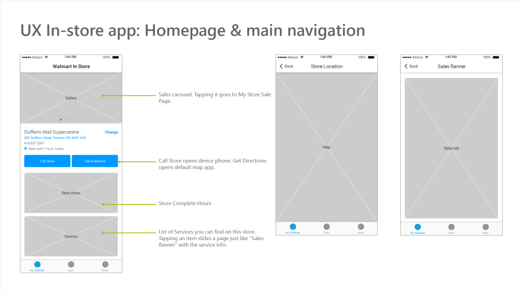
My Walmart would use Geolocation or ask for the user’s postal code to suggest the closest Walmart Store and then use this information to notify users of flash sales and display the latest Store Flyers.
My Role
At first, I collaborated with Sylvia Wong, who created the user journey and kick-started the internal sketching sessions where the whole team worked together to pinpoint the main obstacles of the app.
Following that, I became the sole designer, and my task was to synthesize all the research and requirements that arose from those sessions and then work directly with a Walmart Product Owner and developers to create all the interfaces needed.
Research
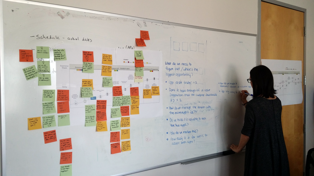
One of our first challenges was estimating the value of having two Walmart.ca apps that could eventually look similar, possibly creating confusion among users. The feedback from Walmart was that they wanted to test these new features on a standalone app first and only then incorporate them into the main E-commerce App.
Our focus at this point was to create a seamless transition between both apps while maintaining a visual distinction between them.
We also found out that users had terrible experiences with the main app scan feature, so we did quick prototypes to overhaul the whole experience, working closely with the development team to make it as fast as possible.
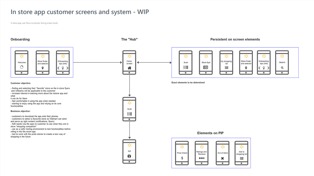
Wireframes
Final Screens
