Stellantis is the fourth largest automaker in the world, operating brands like Alfa Romeo, Chrysler, Dodge, Fiat, Jeep, Ram, and more.
The configurator is a crucial component of Stellantis’ brand sites allowing users to visualize and customize different models, explore all of their features, and fall in love with their design.
It is a significant player for Stellantis in one of the biggest decisions an adult can make: Purchasing a car.
Role: Experience Lead
Year: 2021
Company: Razorfish
Client: Stellantis
My Role
I was the Experience Lead on the project, overseeing three visual designers and facilitating presentations, workshops and solutioning sessions with Stellantis and the brand stakeholders.
The configurator team also comprised two project managers, one Business Analyst, and eight developers.
Challenge
Stellantis configurator worked on six brand sites and 40+ cars. From a simple Fiat 500 to a business-oriented Ram 3500 SRW 10K GVWR Chassis Cab (yep).
Initially, the task was to expand its current use from the US markets to all Stellantis global markets. From Japan to Saudi Arabia, considering all the different languages.
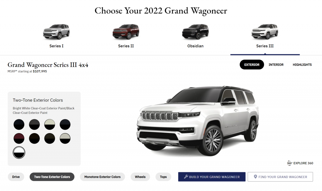
We also had the challenge of incorporating 3D assets on a few special vehicles, like the new Wagoneer. This inclusion required the component to have authorable interaction controls for users to visualize the car from different angles.
I was not happy with the idea of using the same component and just slapping new features to it. As a gamer, I had years and years of experience with racing games that showed me how fun customizing vehicles could be.
So, I proposed a complete rework.
It would be a new experience, correcting all the current pain points and modernizing the look and feel of the configurator while being future-proof for all brands across the globe.
Goals
- Expand the configurator tool to global markets, making it work for six brands, more than 40 vehicles, and 130 countries.
- Identify and fix current pain points, and enrich and modernize the experience with an updated look and feel.
- Add 3D controls and future-proof the component for new unreleased features.
Discovery
The current configurator performed poorly on desktops, tablets and especially mobile, used by more than 50% of Stellantis users.
The first pain point I wanted to address was that it only worked well on large monitors. We knew that 80% of our users had devices with less than 800px vertical resolution, so they had to constantly scroll up and down to interact with all the components’ options.
Also, since this component is the first step in the customer’s journey toward a new car, we wanted to increase the vehicle image size. Every feature and difference between different models had to be easily perceivable.
The third pain point surfaced after I conversed with the Data team and found that user clicks on the component CTAs were low for the number of interactions it registered. After analyzing the data they sent us, it was clear that there was a user disconnection between the customized vehicle and the CTAs displayed in a banner below the configurator.
Updating the UI would also allow us to manage better the number of new interactions needed to accommodate the 3d experience.
In the meantime, I started compiling a mood board and reference list for the interactions and visual design, and there was no better place to look for references for this project than on Racing Games. I’ve had many experiences (aka played a LOT) with them since the Need for Speed franchise changed the game by introducing vehicle customizations.
Exploration
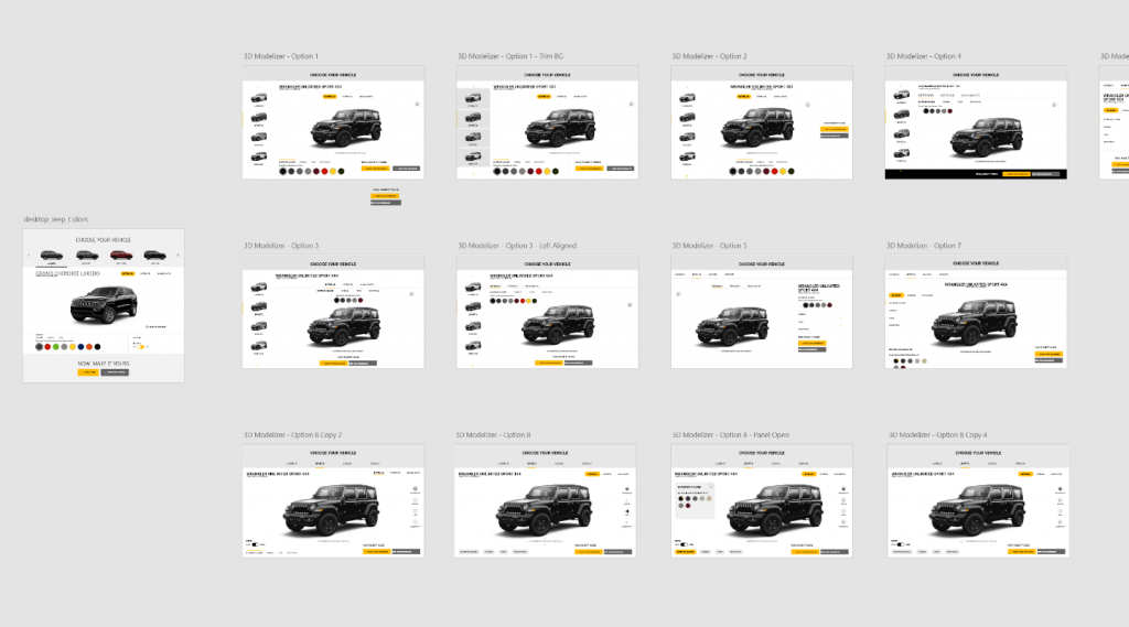
The main idea for the redesign was to use contextual design to deal with all the different components we needed to show. This approach would allow us to display relevant customization options on a need basis, saving space and allowing us to enlarge primary items like the vehicle image while bringing the CTAs closer to the experience.
So, one of our first explorations was figuring out how to group different elements like customizations, vehicle views, calls to action, and the bonus 3D elements in their clusters of information.
This first exercise was beneficial as it allowed us to categorize diverse interactions, split the components into modules, and understand how users would navigate this tool.
One early exploration that didn’t see the light of day was the idea of using hotspots to display different angles and features instead of splitting the interface between Exterior, Interior and Highlights. Users would fully view the vehicle’s exterior and interior while customizing it.
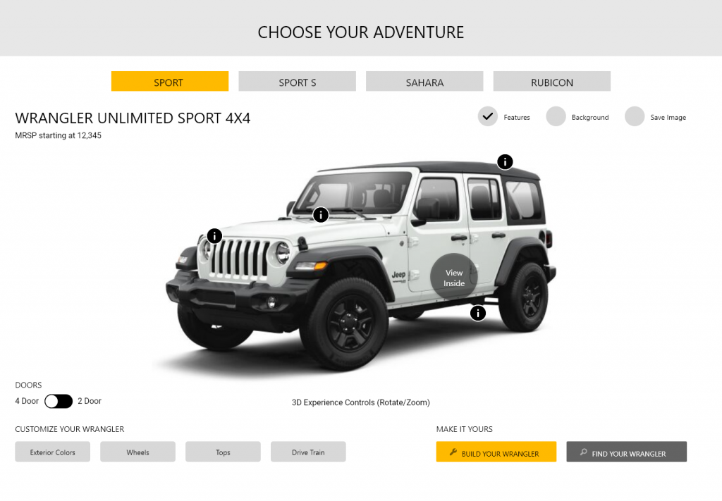
The team and I tried to think of different solutions to make this feature accessible, something we had been thinking about from the get-go. Still, we understood that this interaction had a high LOE (Level of Effort) and would drastically increase the project’s scope. So, unfortunately, we had to remove it.
Although we had to drop this feature, these hotspot sketches proved their value by being the first time customization options were displayed on the bottom left of the vehicle. Something we kept iterating on future revisions.
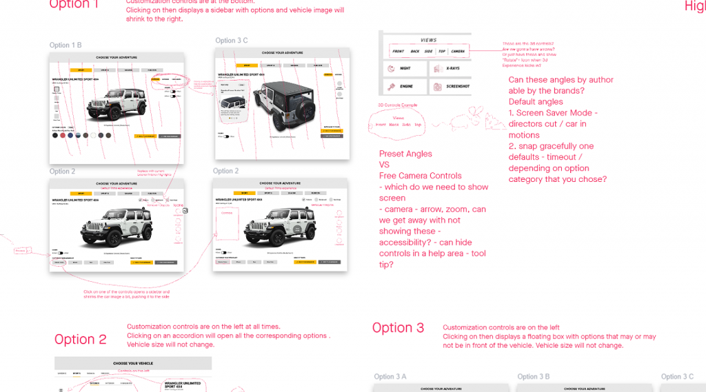
This project happened during the COVID pandemic, so I had to find new ways to collaborate with the team and make clients feel like they were part of the conversation.
We used Sketch + Invision Freehand and Adobe XD for presentations and workshops with stakeholders. It was the quickest way to gather crucial feedback and keep the iteration process going.
Iterations
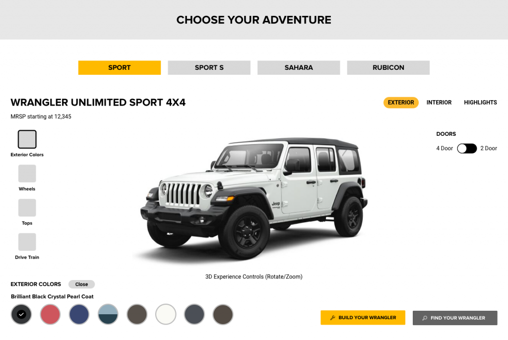
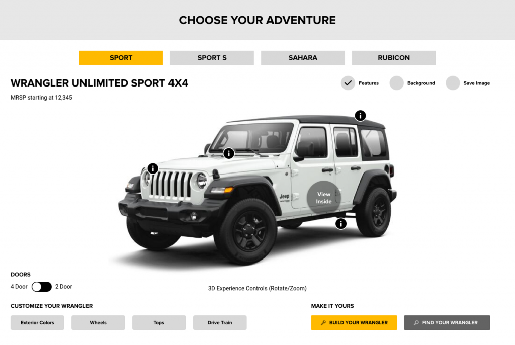
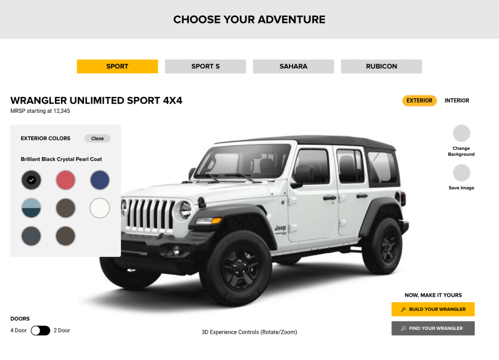
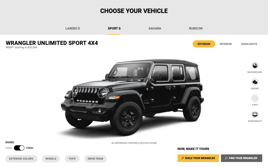
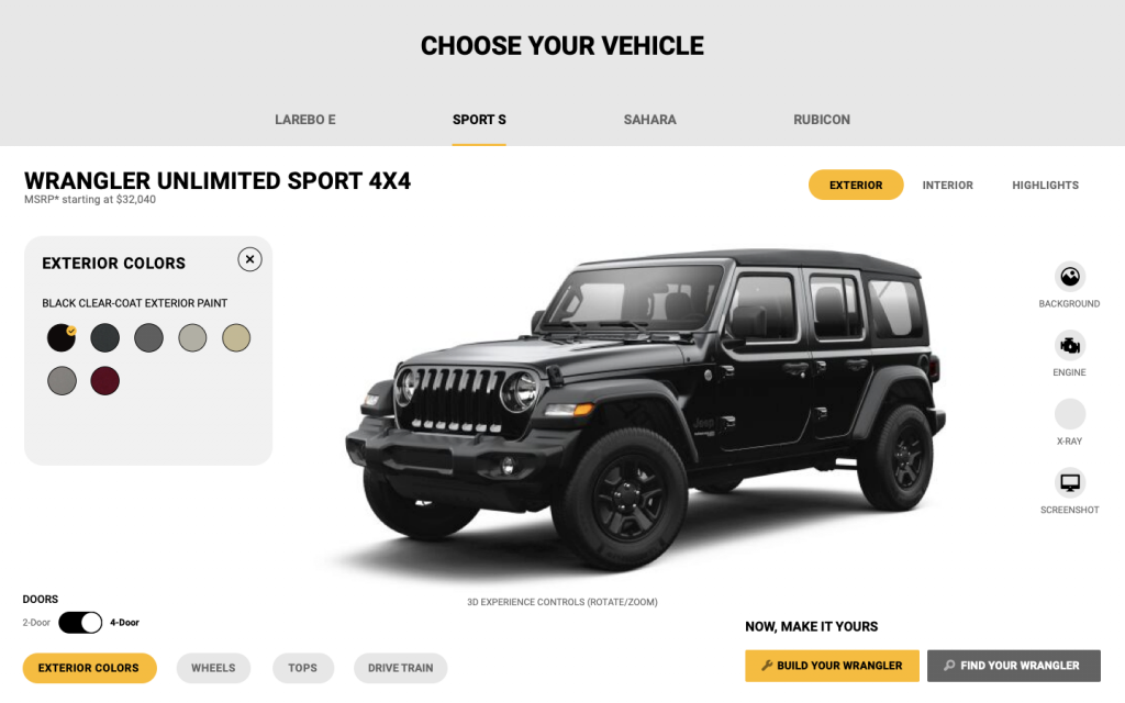
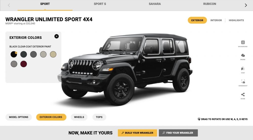
Final Version
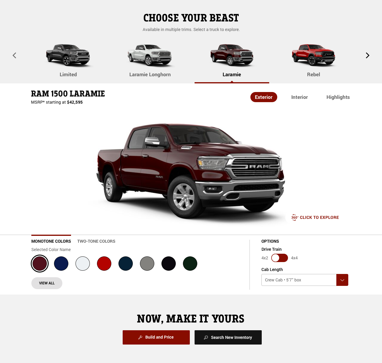
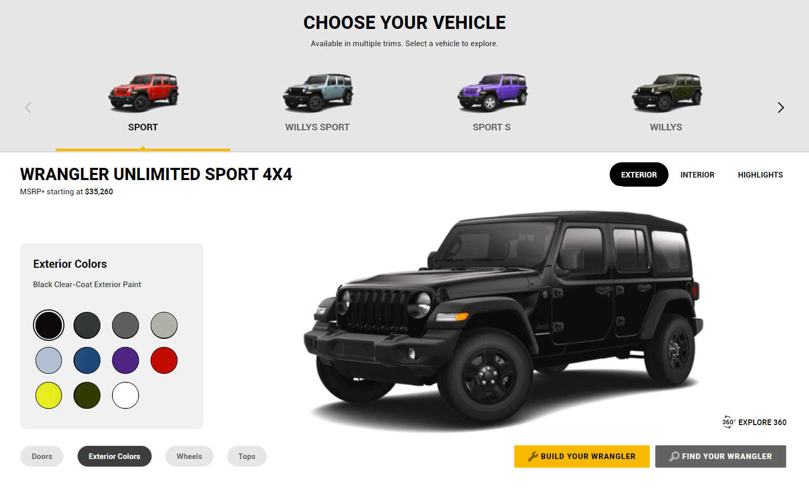
Size comparison between old and new configurators
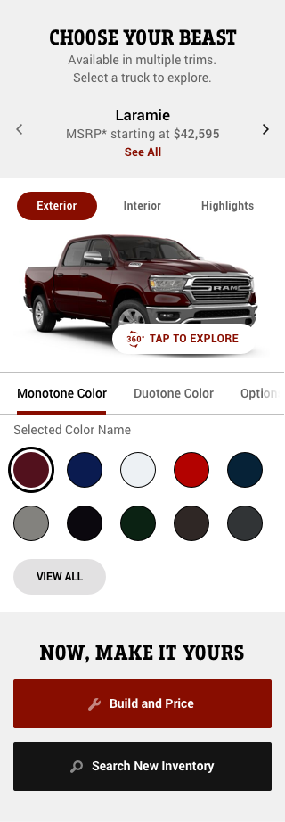
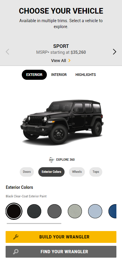
Size comparison between old and new configurators
3D Version Final Design
Impact
Customer engagement increased by 10% on all brand sites
Voted the most helpful tool to buy vehicles by Stellantis’ users
– JD Power Consumer Research
Stellantis was vocal about how happy they were with our approach to taking a holistic look at the component and how we completely revamped it.
Jeep used the 3D implementation as a crucial selling tool for the new Wagoneer line of vehicles, mentioning that their dealerships praised the showroom camera view, widely used during the pandemic to demonstrate the car.
A JD Power consumer research indicated a significant increase in engagement with the new configurator, with customer usage increasing by 10% and a third of the users saying that it was now the most helpful feature on the sites.
The new configurator increased the vehicle image, utilized space more efficiently and made controls more discoverable.
JD Power Customer Research
The Stellantis Configurator is now the most helpful buying tool on all brand sites in 130+ countries.