
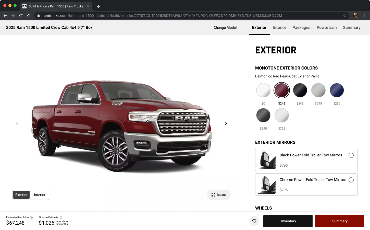
Build & Price is where browsing turns into buying intent. Shoppers configure a vehicle down to trim, colour and packages, see real pricing attached to that exact build, and decide whether to contact a dealer.
It’s arguably the most important tool on an automotive website: 77% of car buyers actively want to use a configurator before purchasing, and 81% research online before ever visiting a dealership. For Stellantis, pushing further into direct-to-consumer digital sales, this is the handoff point.
Role: Associate Director, Experience Design.
Led delivery across all four phases.
Team: 3 designers, PM, PO, lead tech, 5 engineers, QA
Client: Stellantis – Jeep, Ram, Dodge, Chrysler, Fiat, Alfa Romeo
Timeline: 2025 to 2026, shipped in four releases
The Problem
No one asked us to look at Build & Price. There was no brief. The pod took it on because the tool sat at the highest-intent point of the site and hadn’t been examined end to end in years.
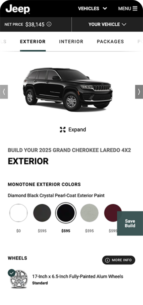
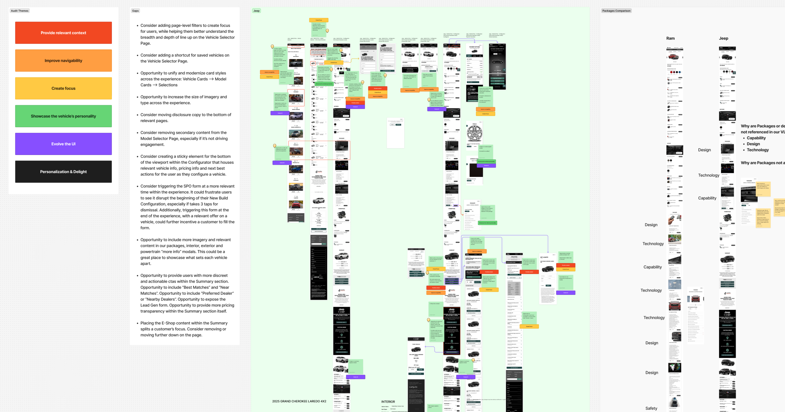
We mapped how customers actually enter the tool, then ran a current-state audit against fifteen competitors and the platform backlog. I ran that audit with another Associate Director under our Creative Director. Three themes came out of it: make things easier to find, guide customers to the next step, and surface pricing clearly enough that they understand what a vehicle actually costs.
J.D. Power’s Winter 2025 study independently echoed all three, calling out an aging tool, small fonts and inefficient layouts.
Underneath it was the number that mattered: 41% of users dropped off at the summary step, the exact moment a shopper was closest to becoming a dealer lead.
Approach
My role
I led the delivery phases: allocating and reviewing the designers’ work daily, working requirements with PM, PO, dev and analytics, presenting to senior client stakeholders with the test plan attached, and turning their feedback into a plan for the team.
Three designers reported to me, one senior and two junior. Beyond design, we worked daily with a PM, PO, lead tech, five engineers and QA.
How we approached it
The brief we set ourselves was deliberately narrow: find high-impact changes that could ship inside the existing platform, not a rebuild.
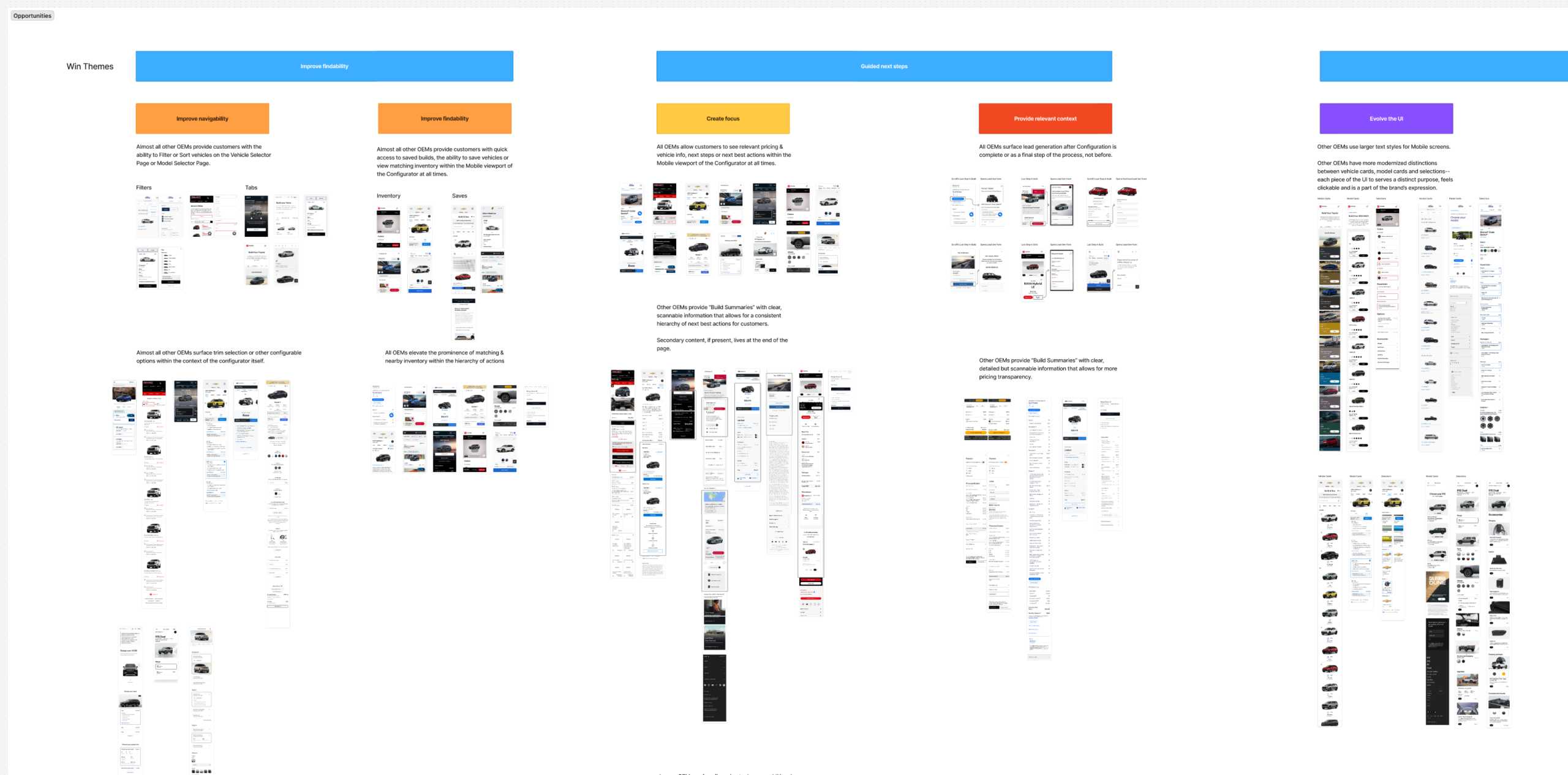
Benchmarking fifteen brands turned observations into evidence. All fifteen elevated matching inventory inside the configurator. All fifteen framed the mobile experience with sticky information and clear next steps. Thirteen prioritized a clear content hierarchy in their summaries. That gave us a case to take to the client: these weren’t preferences, they were table stakes we were missing.
Delivery was broken into four independently testable phases rather than one launch, so each could be validated before committing to the next.
Solution
Four phases, each shipped and measured independently before moving to the next.
Phase 01: Navigation
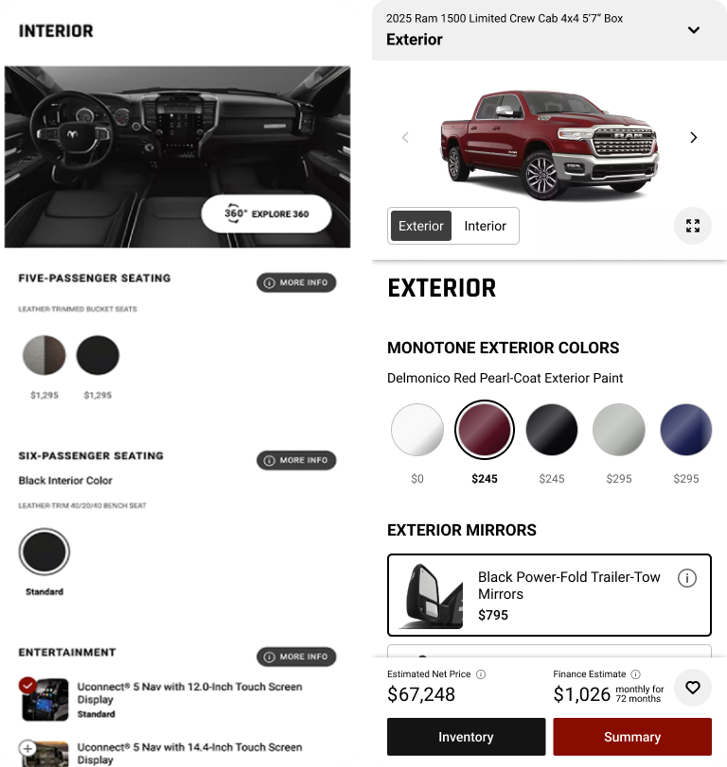
Shoppers were losing their place in the funnel. Competitors weren’t: all fifteen framed their configurator with sticky, persistent information and a clear path forward.
The obvious fix was persistent navigation, but persistent chrome costs screen space, and the client challenged exactly that. We pulled the data instead of arguing it. 53% of our traffic browses at 300 to 500px wide, which turned a debate about taste into a constraint we could design against.
We presented two versions and let the client weigh the trade-off. Both keep model, trim and live pricing in view throughout. On the Summary, the bar reduces to a single next step with local inventory count attached.
Phase 02: UI & Typography
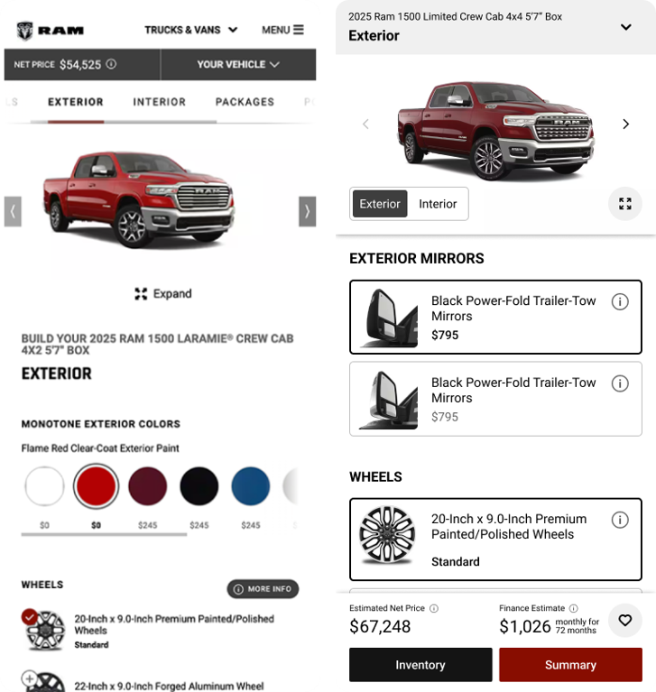
The tool worked, but it looked its age. Cramped text, static elements, a cluttered hierarchy. J.D. Power named the same things independently.
Client review added a constraint alongside the fixes: bigger, more readable cards eat vertical space on the small screens most of our traffic uses. We resolved it by putting type and layout options in front of the client in context rather than settling it by preference.
The pass became the umbrella for a wider modernization, carrying the same visual language into the vehicle image, info icons, modals and save confirmations across the platform.
Phase 03: Packages
Packages was the densest part of the build, and our first pass didn’t land. The client came back with concerns about the section’s look and feel, so we returned to the competitive set rather than redesigning on instinct.
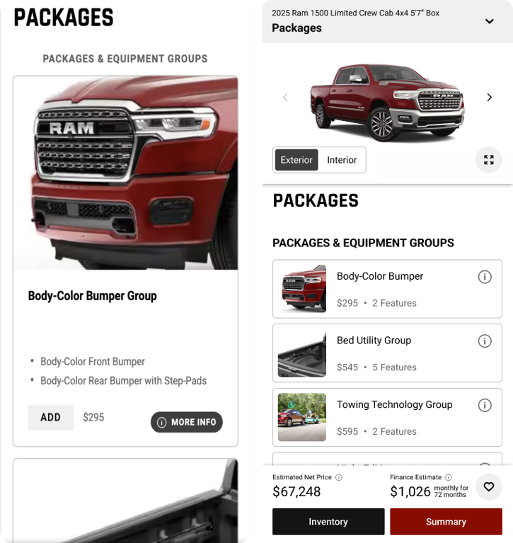
Three patterns held across every brand: show less upfront to invite exploration, use distinct UI styles so the most consequential choices carry the most visual weight, and keep at least two package options visible on a small screen. That gave us scannability, hierarchy and visibility as the criteria to design against.
The result put customers in control of information. A compact card layout surfaces the essentials, details open on demand rather than by default, and new scrolling behaviour shows a selection changing the vehicle in real time.
Phase 04: Summary
The Summary is where the whole tool either pays off or doesn’t. It’s the last screen before a shopper leaves Build & Price, and where they either move into inventory or reach out to a dealer.
Of users who acted here, 33.5% went straight to Search New Inventory, twelve times more than anything else. Payment calculators took another 19.2%. People wanted two answers: can I find this car nearby, and what will it cost me?
Pricing was where we met resistance. It wasn’t in the original scope, and the client wasn’t convinced it belonged on the page. So we ran a second competitive audit specifically on Summary screens, resurfaced the original fifteen-brand audit alongside our analytics, and I walked the client through all of it. They agreed to the approach, and the way we got there did more for their trust in the pod than the feature itself.
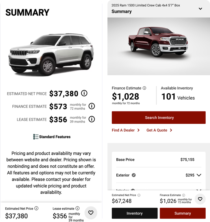
They also pushed back on CTA overload. Every OEM we audited that used sticky navigation kept in-page CTAs alongside it, so rather than cut them we proposed contextual sticky navigation: always visible on desktop, appearing on mobile once a shopper scrolls into pricing.
What shipped leads with Search New Inventory and live local inventory count. Pricing details now work like a receipt, itemizing every selection a shopper made and what it added to the price, with any line editable straight back into the build.
Results
Because each phase shipped and was measured separately, each number corresponds to a specific change rather than to a single launch.
+14.5% lead starts. Streamlining the final summary step triggered a surge in users initiating a dealer lead action, including Get a Quote submissions.
+21.5% packages interaction. Moving to simple visual cards and pushing deeper options behind a clean info icon drastically increased engagement.
+13.7% Build & Price to inventory search, summary phase. Stripping layout clutter on the final step channelled higher-intent users directly into dealer inventory.
+11.8% Build & Price to inventory search, navigation phase. Keeping the next sequential action visible throughout accelerated transitions to local dealership stock.
The navigation phase also lifted build completions by 3.2%. At the volume these sites carry, that’s tens of thousands of additional completed builds.
Testing reached full statistical significance across major brands. The read was that the new Build & Price keeps users engaged with the Summary instead of skipping through it, and is more effective at moving them into a lead-forming action.
No one briefed this project. It started with a pod deciding to look.